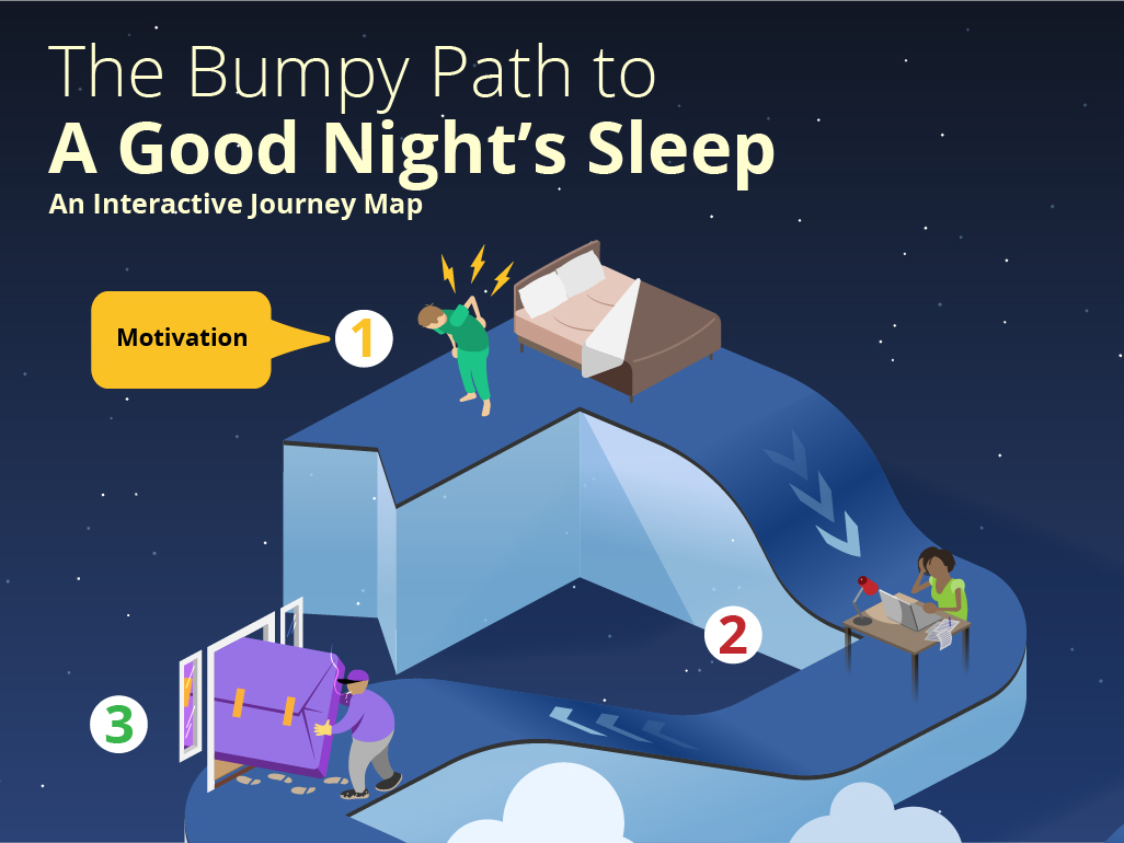
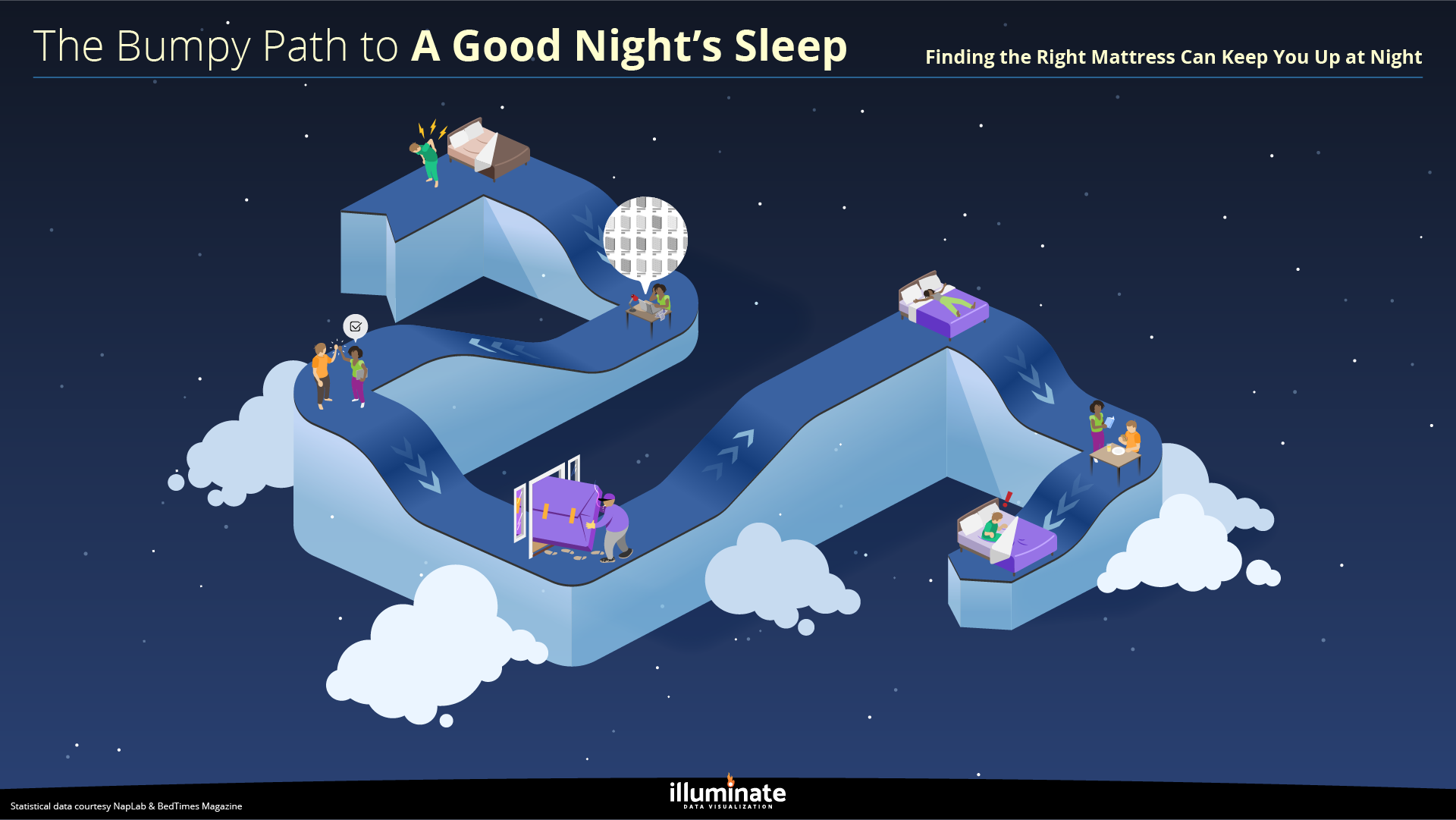
Interactive Journey Map: The Bumpy Path to a Good Night’s Sleep
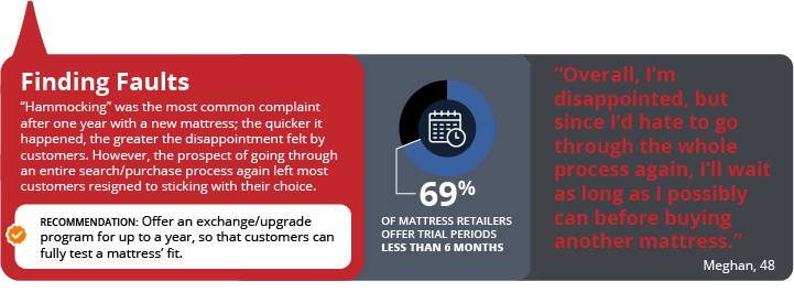
This is just a sample, but pop-ups in the infographic below can include text, images, video, audio and charts/graphs to enrich the insight sharing experience. To interact with this infographic, simply hover your cursor (or tap) over any of the numbered points along the path.
It’s easy to mistake quantity for quality. Providing your clients an ocean of data shows the thoroughness and depth of the work you’ve done, right? Sure, but it’s easy to lose sight of the key takeaways and actionable insights if your client is lost at sea.
The solution is to rescue your insights with visualization:
Infographics
Richly visual and powerfully concise, infographics can summarize entire studies into one comprehensive piece, making the full scope of a project easy to comprehend and fun to socialize within your organization.
Presentation Decks
Whether a short presentation deck or an in-depth report, we can elevate your research beyond those stale PowerPoint templates and cookie cutter charts and graphs to make each slide unique.
Video Sizzles
Bring the accessibility of video to your research by explaining the key insights with video, animation, music and voiceover. We can edit highlights of qualitative fieldwork or create graphics to convey quantitative findings.
Make the insights you’ve discovered easy to understand, socialize and act on, and your clients will see you as an indispensable partner in their success.
Click here to see more samples of how visualized data makes the most important insights clear. Would you like to chat with us to see how we can illuminate your data? Drop us a line.
In parts of Europe and Asia, octopus is a popular food source, with a multibillion-dollar industry built around catching and serving them. As interest in octopus as a food source grows, whether to farm them has become a subject of debate. Here’s a brief look at the stats on the worldwide octopus industry, and sentiment in the US about eating them.
This was a quick piece that tells a data-driven story clearly, succinctly and beautifully. If you would like to present your insights in a way that grabs your audience’s attention and entertains while it educates, please send us a note!
We all use icons, but not all icons are created equal.
A hodgepodge of stock icons you found on the internet will likely hurt your presentation deck or infographic more than they will help it. They don’t fit with each other, they don’t support your brand, and they tell an incomplete story. The result is a lower opinion of – and therefore lower engagement with – the information you’re presenting.
Here are a few good reasons for designing visually unified iconography for your marketing & presentations.
1. Greater Cohesion
Unify your piece with icons that are all in the same visual style, a style that supports your brand and/or the message you’re conveying.
2. More Specificity
Icons that are custom-designed for your specific use tell a richer, more precise story, which better educates your audience.
3. Increased Interest
Novel imagery captivates in a way that stock icons cannot. Beauty will keep your audience focused on your important content.
Tell the whole story with custom icons, tell it beautifully, and you’ll see better results.
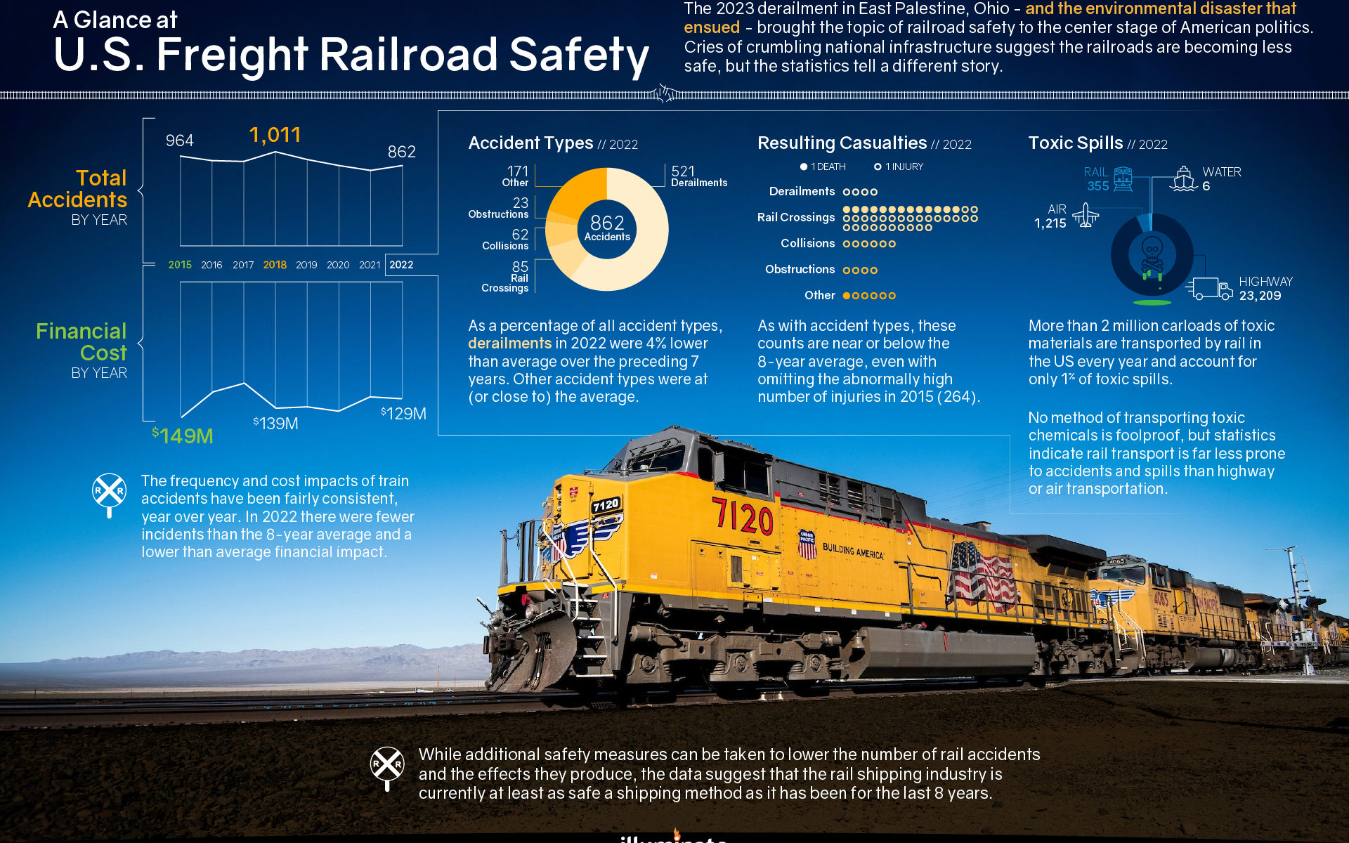
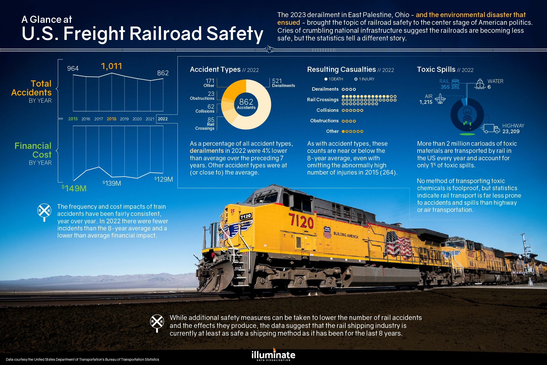
The 2023 derailment in East Palestine, Ohio – and the environmental disaster that ensued – brought the topic of railroad safety to the center stage of American politics. Cries of crumbling national infrastructure suggest the railroads are becoming less safe, but as shown in the nearby infographic, the statistics tell a different story.
click image to see full size
This concise – and beautiful – infographic conveys trends in railroad accidents since 2015, a breakdown of the causes and related casualties, and the financial impact of such incidents. It also compares the statistics of toxic spills, by type of transportation. The data show that while improvements can always be made to enhance safety and reduce accidents, freight rail continues to be a statistically safe means of transportation toxic materials.
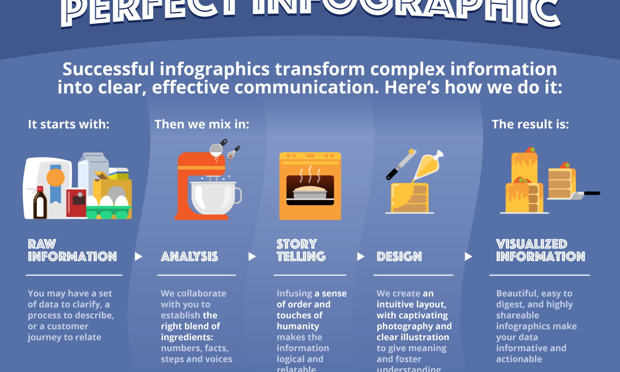
In case you were curious about our approach to creating beautiful infographics, look no further. This is a concise overview of our method, starting with your raw information and finishing with a captivating, intuitive and fun-to-socialize infographic. The stuff we love doing is all the steps in the middle.
Analysis is like discovery: we learn about the information you wish to share, so that we fully understand it. It helps us collaboratively figure out which components are key ingredients, which add a little spice, and equally important, which to leave on the shelf.
Storytelling is where we map out the progression of information, organizing the elements in the proper order. As with the baking analogy in this piece, we often build a meaningful analogy around your information at this stage, to frame the information in an accessible way. If there are ways we can bring unique perspectives or voices to your piece, that nuance makes the final product all the richer.
In the Design phase, the story comes vividly to life, tailored to your intended audience. We source (or shoot) photography, craft illustrations of all kinds, and in the case of interactive infographics, we build digital experiences that all convey your data in a clear and concise manner.
At the end, you’ll have the perfect infographic that is easy to understand, easy to socialize to your audience, and one that you’ll be excited to share.
If you have a process or a set of data that would benefit from visualization that tells compelling stories, we’d love to hear from you.
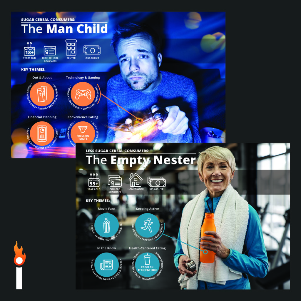
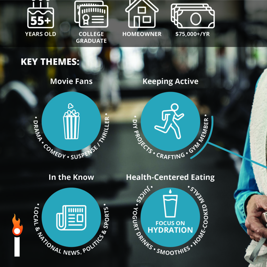
You’ve conducted the research to decipher who your market segments are. You now have spreadsheets full of data. But how can you make this information easily understood and shared, so that everyone in your organization – from R&D to Marketing – can act on it?
When you truly know your audience, you know how to win them over. To understand your market segments, they need faces and real-life context to give the data meaning.
A compelling blend of photography, typography and iconography will not only convey your segments’ data, but help you to envision their priorities, their wants and needs, and their humanity. And being concise and beautiful, they’re easy to share with everyone in your organization.
The attention span of your audience can be a major obstacle in ensuring your insights are heard, understood and embraced. It’s a delicate balance between capturing the full story and keeping people engaged. By creating beautiful, concise executive decks and compelling explainer videos, we can help present your story in a way that does both.