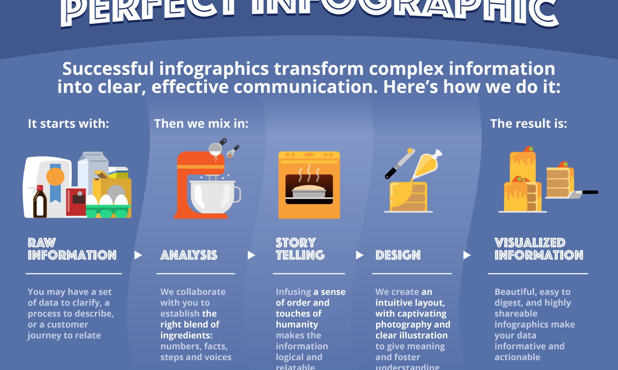
In case you were curious about our approach to creating beautiful infographics, look no further. This is a concise overview of our method, starting with your raw information and finishing with a captivating, intuitive and fun-to-socialize infographic. The stuff we love doing is all the steps in the middle.
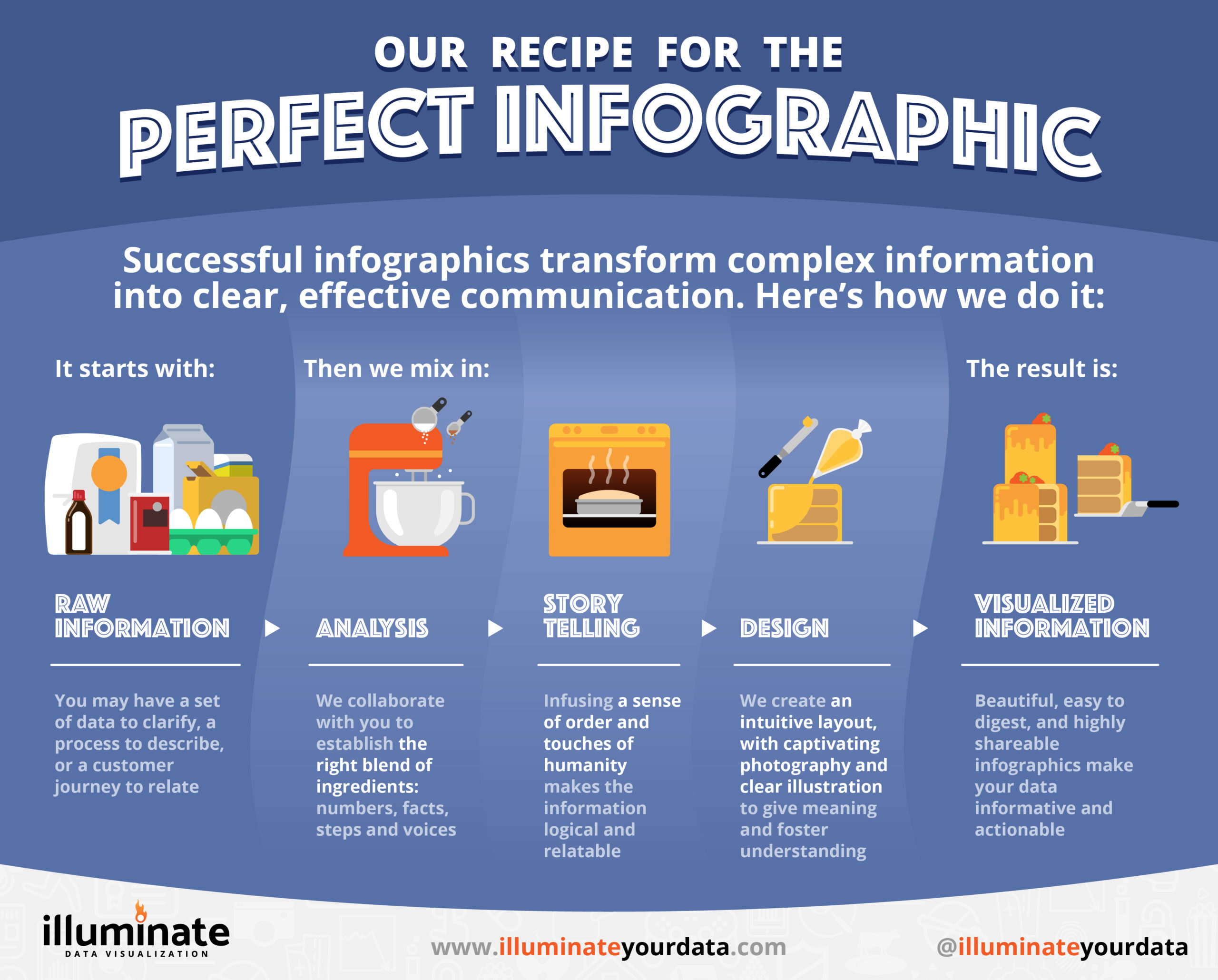
Analysis is like discovery: we learn about the information you wish to share, so that we fully understand it. It helps us collaboratively figure out which components are key ingredients, which add a little spice, and equally important, which to leave on the shelf.
Storytelling is where we map out the progression of information, organizing the elements in the proper order. As with the baking analogy in this piece, we often build a meaningful analogy around your information at this stage, to frame the information in an accessible way. If there are ways we can bring unique perspectives or voices to your piece, that nuance makes the final product all the richer.
In the Design phase, the story comes vividly to life, tailored to your intended audience. We source (or shoot) photography, craft illustrations of all kinds, and in the case of interactive infographics, we build digital experiences that all convey your data in a clear and concise manner.
At the end, you’ll have the perfect infographic that is easy to understand, easy to socialize to your audience, and one that you’ll be excited to share.
If you have a process or a set of data that would benefit from visualization that tells compelling stories, we’d love to hear from you.